Colorful Quiet Luxury: Why Confident Color Feels More Luxurious Than Neutrals
For a long time, quiet luxury had a very specific (read: boring!) look. Soft neutrals, tone-on-tone rooms, everything carefully chosen and slightly understated, the kind of spaces that feel calm and curated but can also start to blur together after you’ve seen enough of them.
Lately I’ve been having the same conversation with clients over and over again. They want homes that feel timeless and easy to live in, but they also want them to feel personal, layered, and unmistakably theirs, not like a beautifully styled house pulled straight from Pinterest.
That’s where color comes back into the picture (finally!). Not in a loud or trend-driven way, but in a grounded, confident way that adds depth and soul without disrupting the calm.
(Prefer to watch instead of read? Check out the video of this blog post here.)
Why Colorful Luxury Is Rising
Because we’re all tired of playing it safe! White walls, beige sofas, neutral-on-neutral decisions that technically work but don’t really say anything about the people who live there – this trend is on its way out.
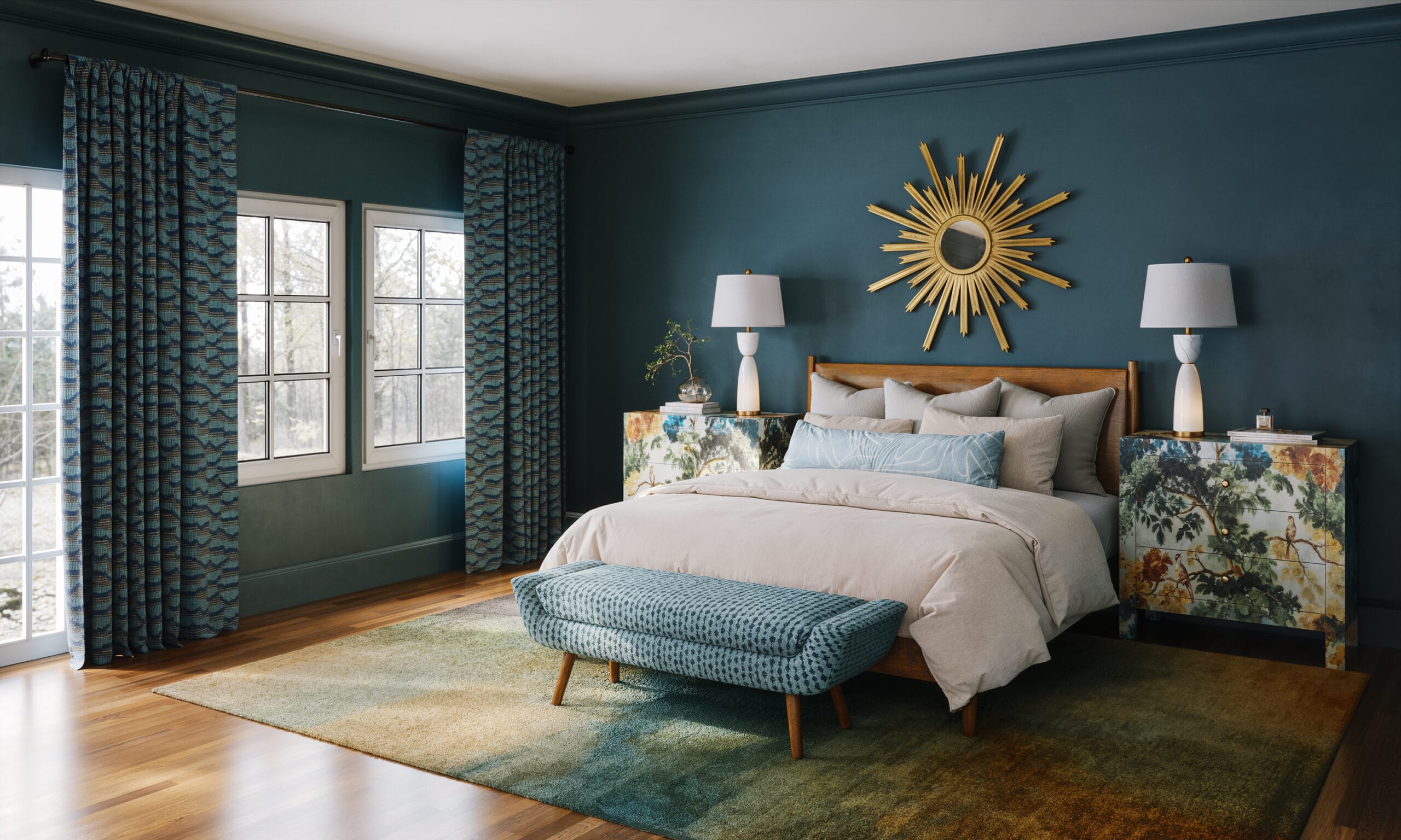
When color is used well, it reads as confidence. Choosing a deep green, a moody blue, or a warm clay tone and actually committing to it changes the energy of a room immediately, because it feels intentional and self-assured rather than cautious.
This isn’t about making a statement just to make one. Colorful quiet luxury is elevated, edited, and thoughtful, with rooms that still feel calm and livable but have much more presence and depth than the all-neutral spaces we’ve been seeing for years.
How Designers Build Confident Color Palettes
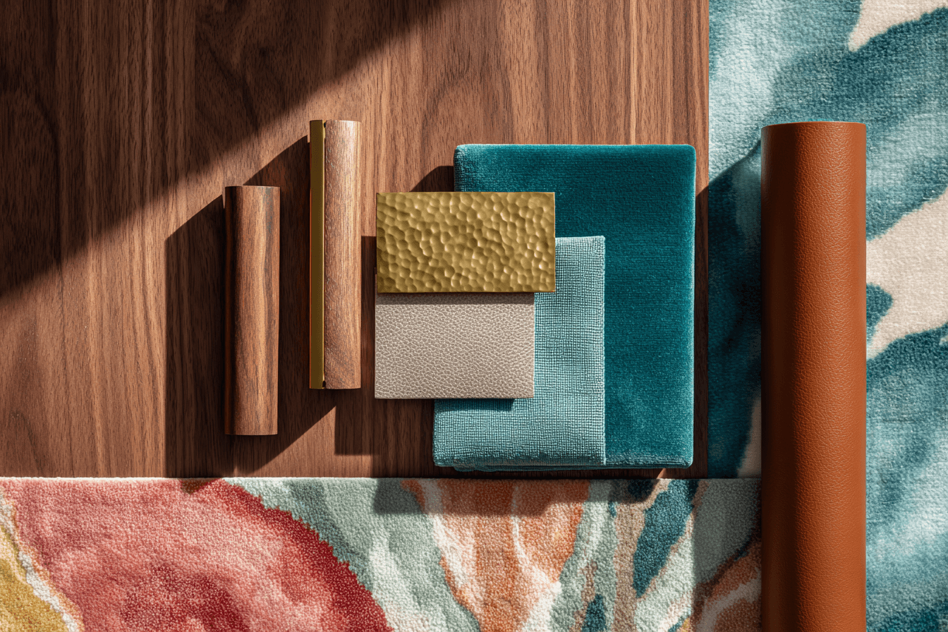
Good color doesn’t start with a single paint chip taped to the wall. It starts with undertones, contrast, and how colors behave together across a space, because a green that leans warm will feel completely different next to walnut than it will next to gray stone.
Texture plays a huge role here, and it’s often the difference between a room that feels rich and one that feels busy. The same color on velvet, plaster, or wood will read softer, deeper, and more layered than it ever will on a flat painted wall.
Restraint is what holds it all together. Not every surface needs to be bold, and not every piece needs to be special. Strong color needs quieter moments around it so it can breathe, and when a room starts to feel like it’s doing too much, the solution is almost always editing rather than adding.
Colors That Feel Luxurious Right Now
Certain hues consistently show up in our design projects that feel elevated and timeless.
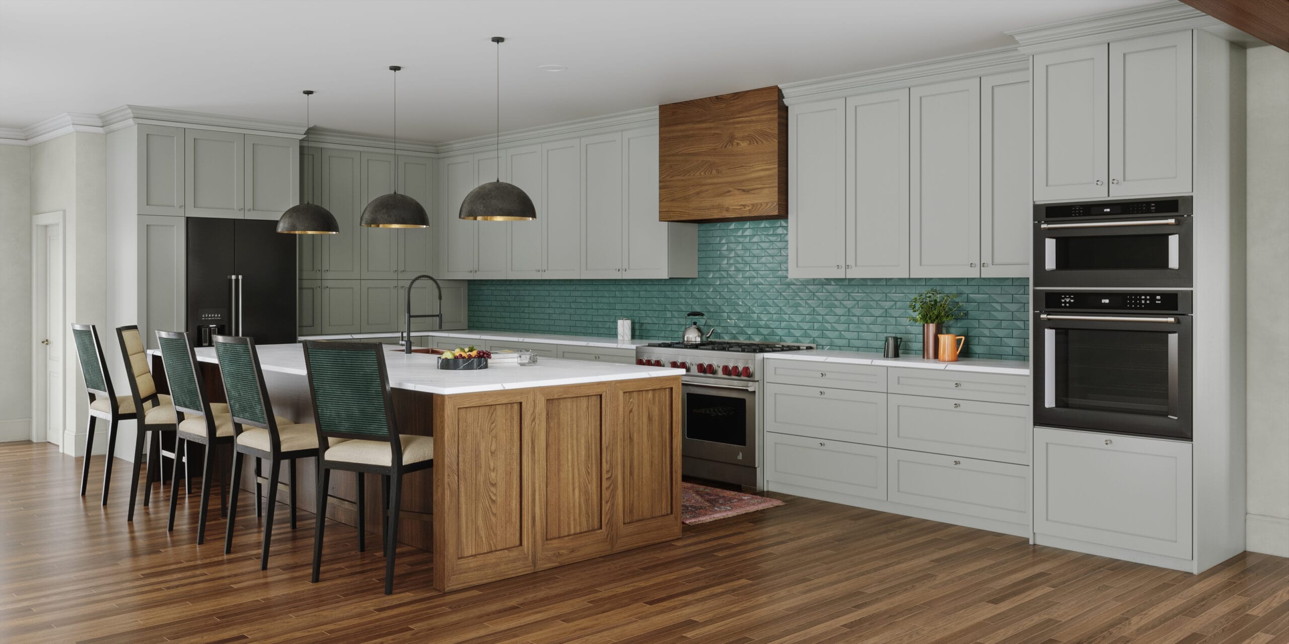
Teal and deep green continue to be favorites because they’re grounding and flexible and (somehow?) manage to feel classic without being boring. They work just as well in a kitchen or office as they do in a living room or bedroom, and they anchor a space without taking it over.
Warm clay and terracotta tones are another go-to, especially when they’re paired with plaster walls, natural stone, or walnut. These colors add warmth and softness while still feeling grown-up and refined, not trendy.
Soft pinks and complex neutrals are also having a moment. Dusty rose, mineral beige, and warm greige bring depth and warmth without feeling sweet or safe, and they tend to age really well.
What all of these colors have in common is complexity. They don’t feel brand new or overly saturated. They feel like they’ve been around for a while, which is often what makes them feel luxurious.
I think of colorful quiet luxury as richness without noise. Color shows up in a few intentional places, through art, upholstery, rugs, or paint, and it does its job without competing for attention.
The space still feels calm and edited – it just has more personality and more soul.
Look for hues with depth and subtlety. Forest green, oxblood, tobacco, midnight blue, ochre, aubergine, muted teal, dusty rose, and warm clay tones all work beautifully when layered thoughtfully and paired with quality materials. When in doubt, look for a more toned down version of a bright color you’re drawn to (for instance, choose a dusty mineral blue over intense cobalt).
A Final Thought
The homes that feel the most luxurious to me aren’t the most neutral or the most expensive – they’re the ones where every choice feels considered and intentional, even if you can’t immediately put your finger on why.
Quiet luxury was never about disappearing into the background. It was always about confidence, quality, and restraint. Color just makes that confidence visible!
If your home feels calm but a little flat, color might be the missing layer. When it’s done well, color doesn’t shout – it just quietly makes everything better.
If you’re planning a renovation, addition, or whole-home project and want a home that feels calm, layered, and truly yours, this is exactly the kind of work I do. Inquire here to start the conversation and see if we’re the right fit.
About Lesley Myrick
Lesley Myrick is an adventurous, intuitive, and exceptionally organized interior designer specializing in designing distinct “forever homes”. She works with high-achieving professionals to create playful, personality-driven and family-friendly spaces that are as functional as they are unique.
At Lesley Myrick Interior Design, we make the typically confusing design process seamless. Our high-touch, deeply engaged design process means that we accept just 6 large-scale remodeling projects per year.
Learn more about our full-service interior design and inquire here to start your design project.