Before and After: A Shared Kids Bedroom
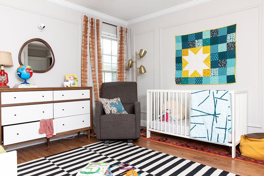
Who doesn’t love a good before-and-after? Get ready, because all month long I’m sharing a tour of our Texas home, including the living room, master bedroom, kids bedroom, my office, my husband’s office, and the kitchen. This week: the shared kids’ bedroom that my 5 year-old son and 2 year-old daughter loved.
Disclosure: Some of the products in this before-and-after were sponsored by brands I use and love for myself and for my clients, including Sherwin-Williams, Lamps Plus, and Metrie. Thanks for your support!
In a 1500 square foot home with two home offices,
we kinda sorta ran out of space for the kiddos. (Whoops!) So once 2- year old Hasley outgrew her nursery that was located in the master closet – yes, in a closet – she moved in with big brother Ford. And let me tell you, they LOVED sharing a room! Especially when it looked awesome.
But it wasn’t such a great space when we moved in. Here’s the kids’ bedroom, before.
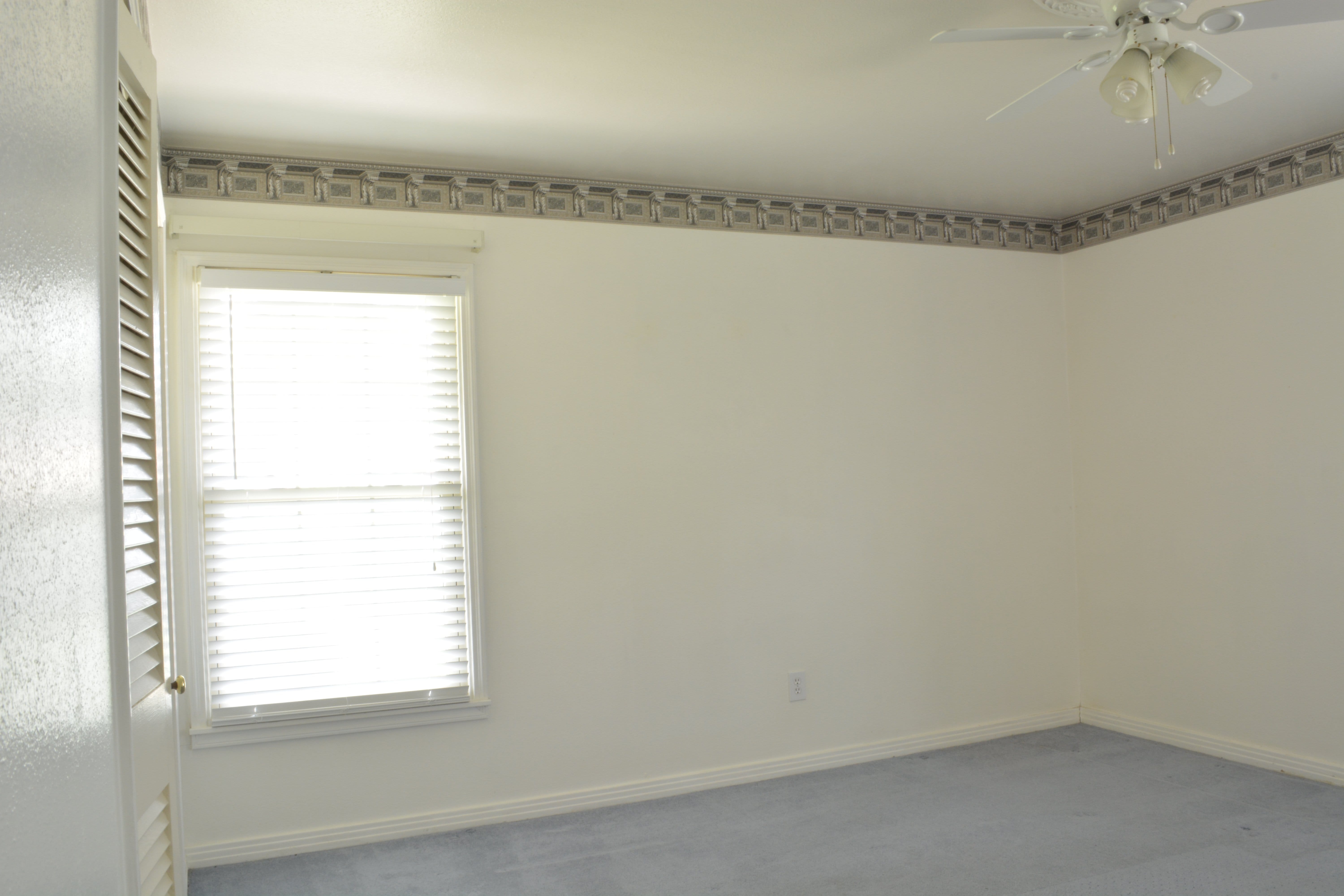
That wallpaper border, right? We tore that sucker down pretty quickly.
Just like in our master bedroom, the kids’ room was majorly lacking in architectural detail. We added crown molding and panel molding, and also replaced the baseboards with interior finishings from Metrie.

The wall color?
I know you’re shocked, but yes, it is a neutral! Sherwin-Williams Agreeable Gray is an easy-to-live-with neutral hue that isn’t beige. Bright colors work best in kids rooms when they’re in small, removable doses. Kids’ color preferences and tastes change so quickly, and it’s much easier to replace some accent pillows and a rug than it is to repaint a room.
Lighting is so important for creating a comfy, cozy kids space, so we included a vintage red lantern table lamp, as well as a vintage-inspired aged brass 3-light floor lamp from Lamps Plus.
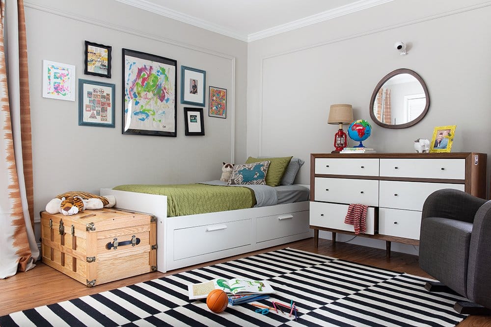
The gallery wall above Ford’s bed included artwork he created at daycare, school photos, and vintage prints. I prefer artwork to be hung lower, but when you’ve got a 5 year-old in the bed below you’ve gotta keep stuff out of reach!
The rug is iconically IKEA (but I bet you figured that out, as this rug has been seen everywhere in the last few years) and the burnt orange curtains are from Half Price Drapes.
You’ll notice that this shared kids bedroom is a lot more budget-friendly than some other spaces we’ve designed, because we knew we weren’t staying in this home forever, and because little kids ruin stuff. Ha.
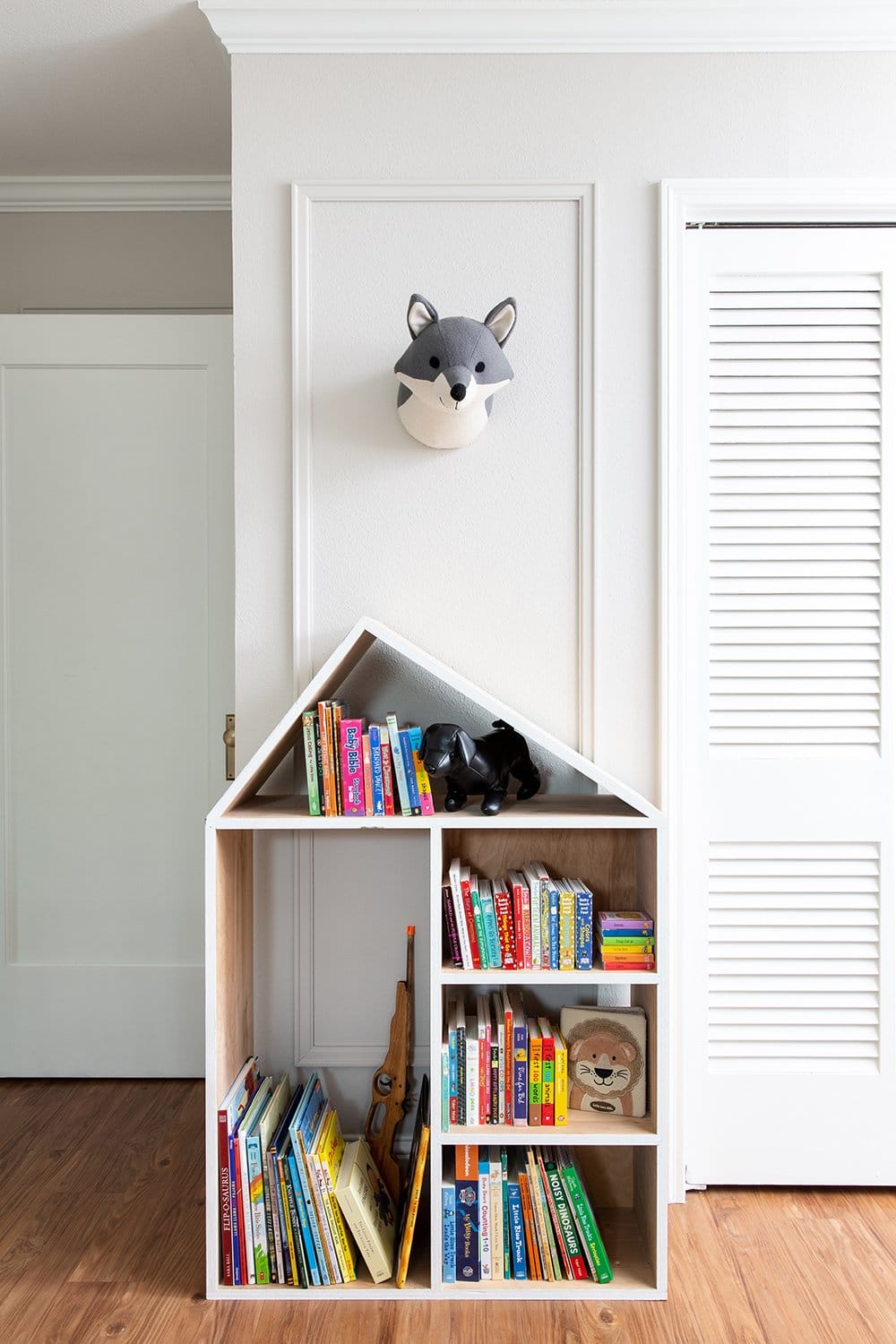
This bookshelf is one of my favorite pieces that we’ve moved from California to Texas and now to Georgia. It used to be a store display for Madewell, and thanks to a friend who worked there, we rescued it from the trash. I can’t wait to see my daughter turn it into a dollhouse when she’s a bit older.
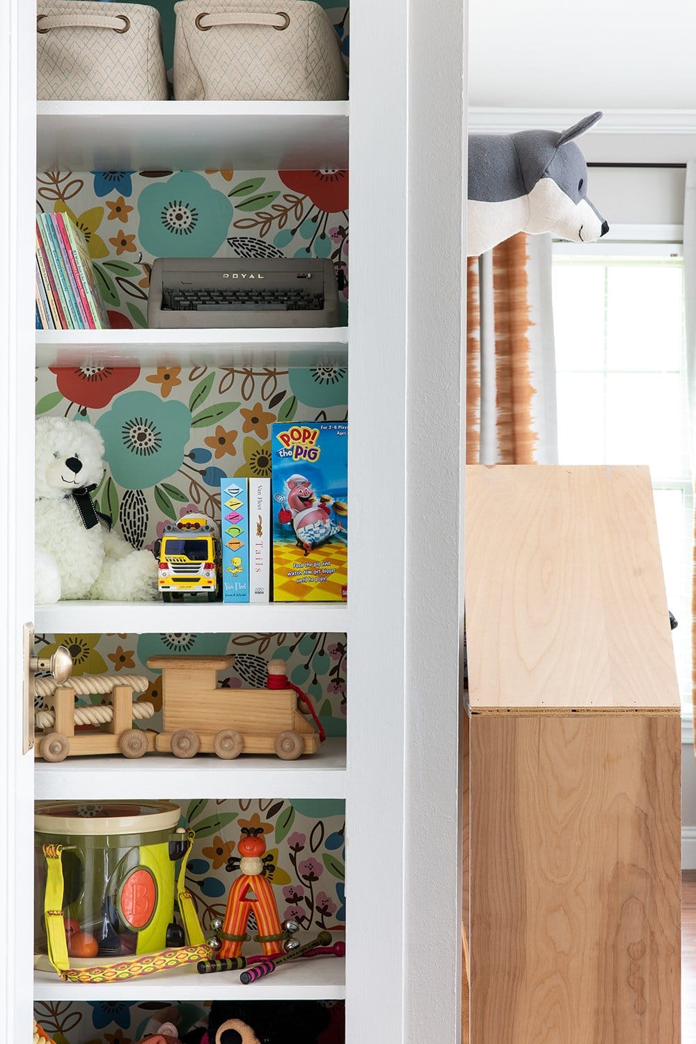
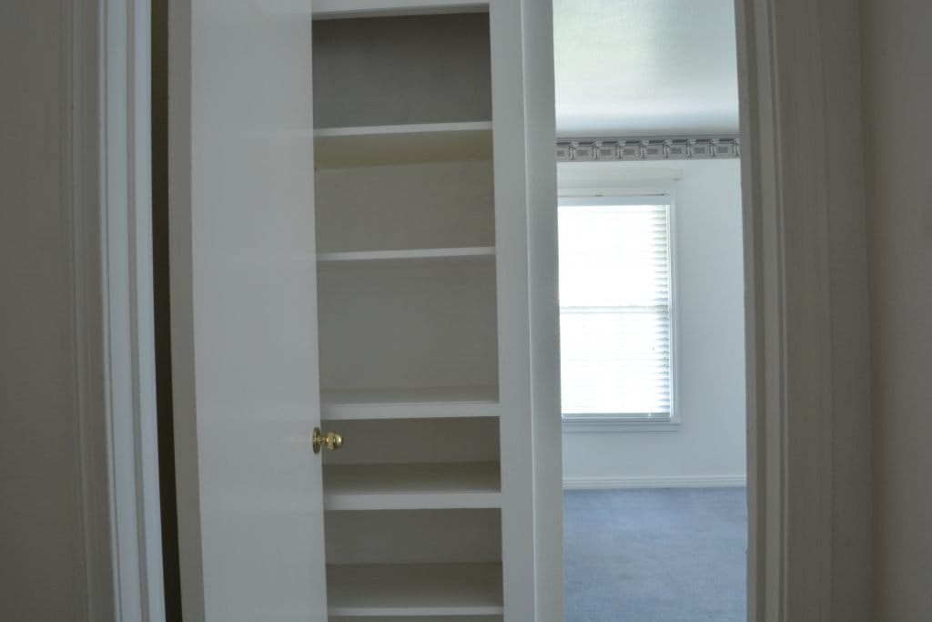
This little built-in shelf tucked behind the door is one of my favorite features of this bedroom. A fresh coat of Sherwin-Williams Extra White paint (my favorite pure, clean white) and a little removable wallpaper jazzed it up nicely.
Now that we’ve moved into a larger home, Ford and Hasley each have their own bedrooms again. (Here’s Ford’s new room if you’d like to see.) I definitely miss this cute shared space, but I’ll be honest – we’re all sleeping better now that the kiddos aren’t within arms reach of each other all night!
Ready to start your design project? Learn more about our services or inquire with project details to get started.
