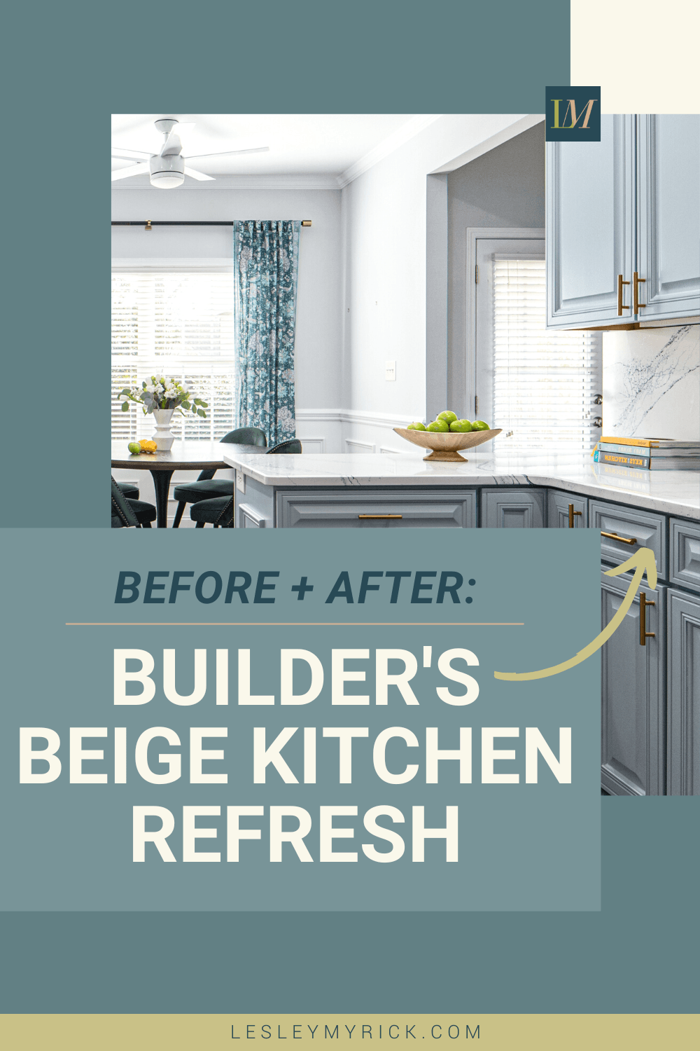
Before and After: Builder’s Beige Kitchen Refresh
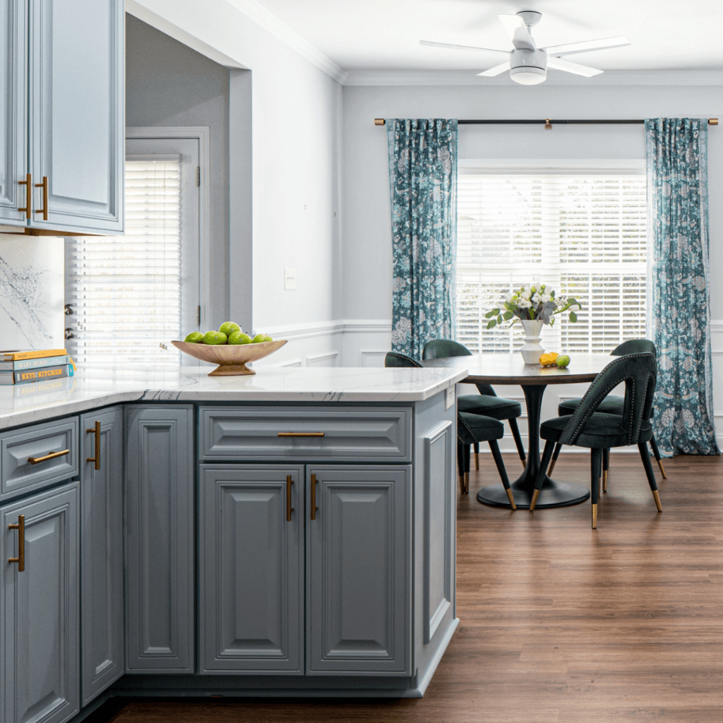
A professional family in Kathleen, GA purchased their first brand-new home a decade ago, and after 10 years of living with dark cabinets and brown floor tiles, they were ready for a light and bright refresh. We redesigned their builder’s beige kitchen with new flooring, fixtures, and high-end finishes to bring new life to this tired space.
Here’s a look at the entire project from start to finish.
Builder’s Beige Kitchen, Before
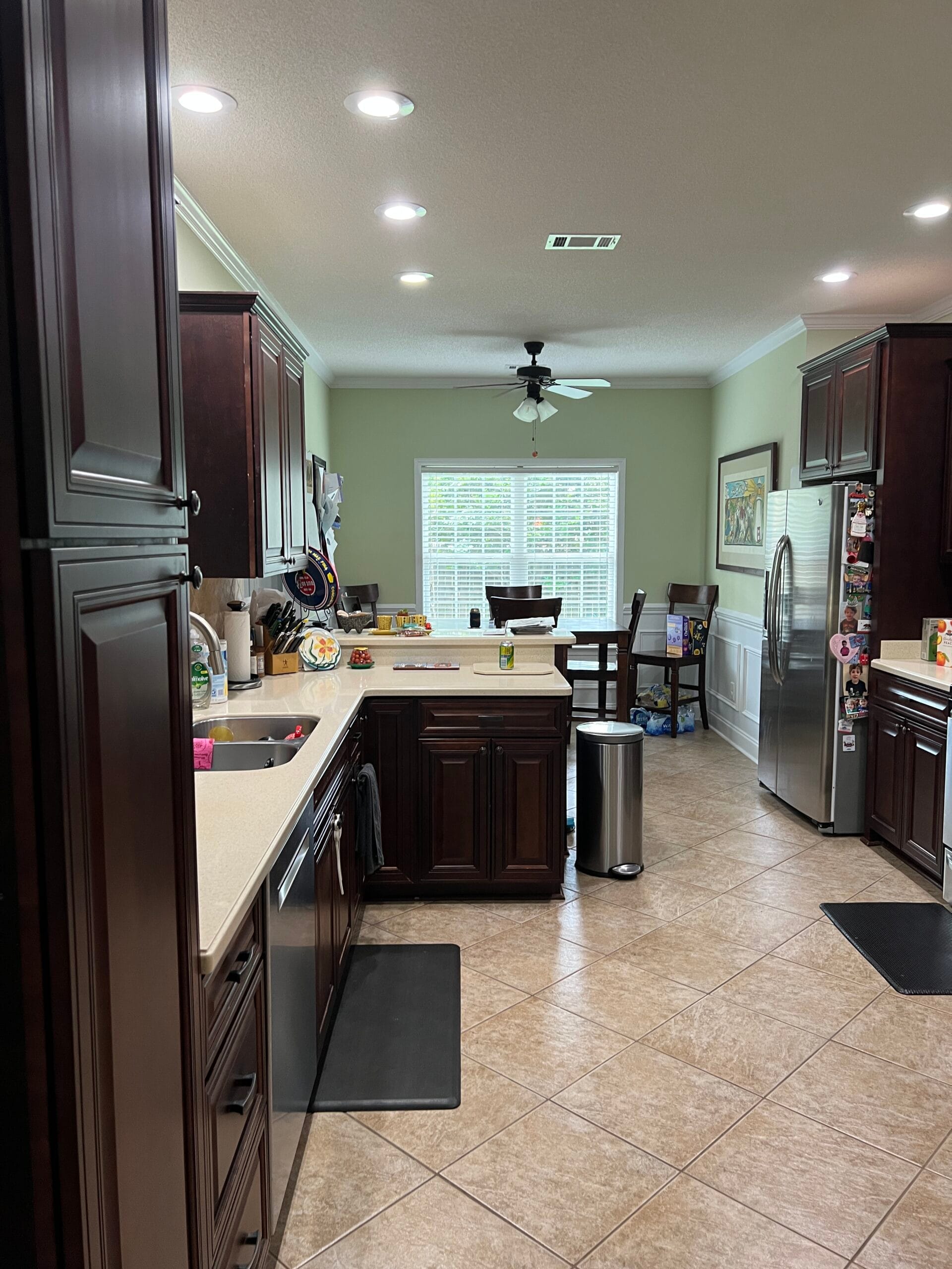
Brown, brown, beige, and more brown! Dark cherry cabinets were trending 10 years ago, but now feel heavy and tired. Yellow-toned beige countertops and orange-toned beige floor tiles kept this kitchen squarely in the past, and the raised breakfast bar was just a surface to collect clutter.
Builder’s Beige Kitchen Moodboard
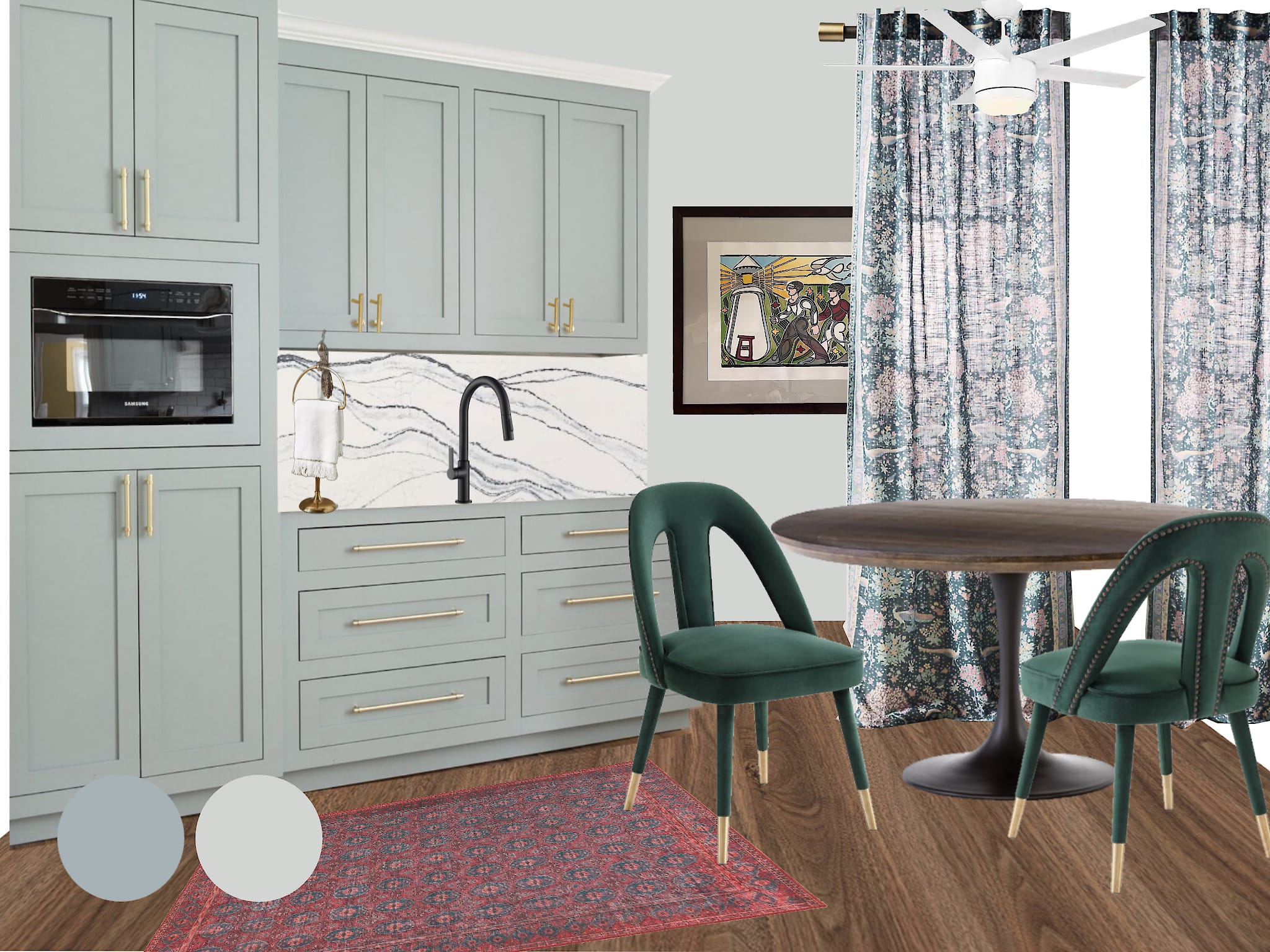
To communicate our design vision to the clients, we created this moodboard with soft blue cabinets, gold-toned accents, and a gorgeous navy and white quartz countersplash that modernized this dated kitchen. The clients decided to keep their existing appliances and invest in high-end finishes like this stunning navy and white quartz with metallic flecks. It was a worthy splurge that elevated the entire design.
In the dining area, we proposed replacing the dark wood pub-height table with a Mid-Century style tulip table paired with cool and contemporary velvet dining chairs with open backs and unique metal details. Semi-sheer patterned curtains and a walnut curtain rod with simple brass finials completed the design.
Builder’s Beige Kitchen, After
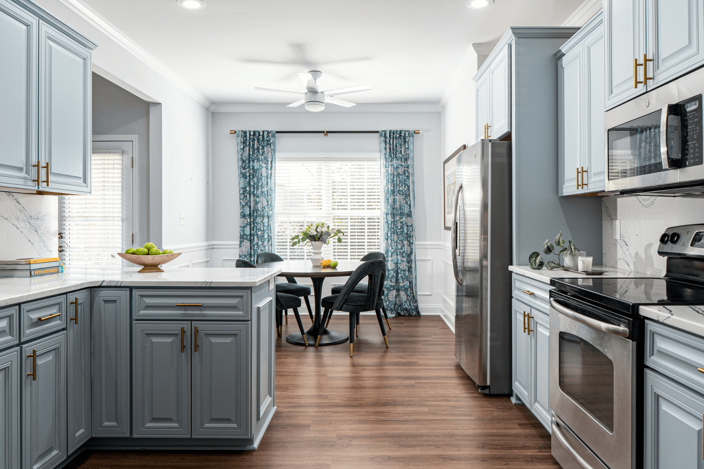
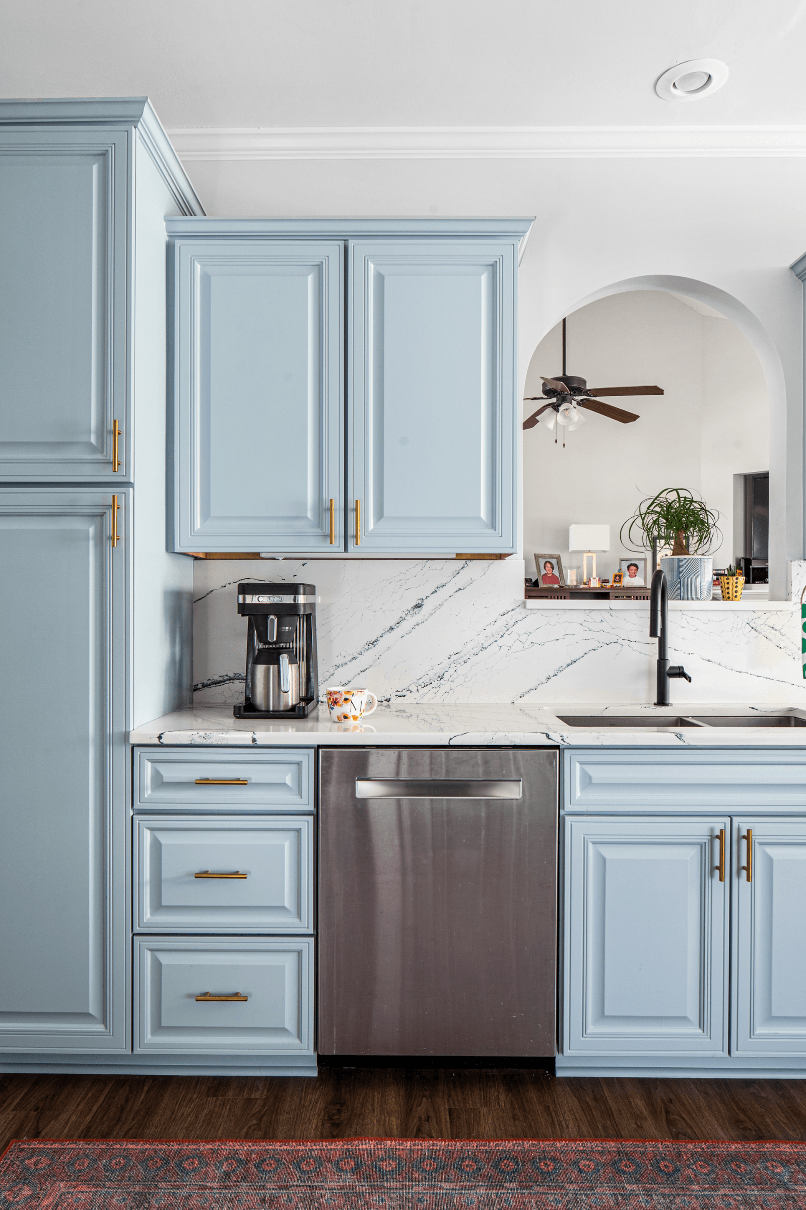
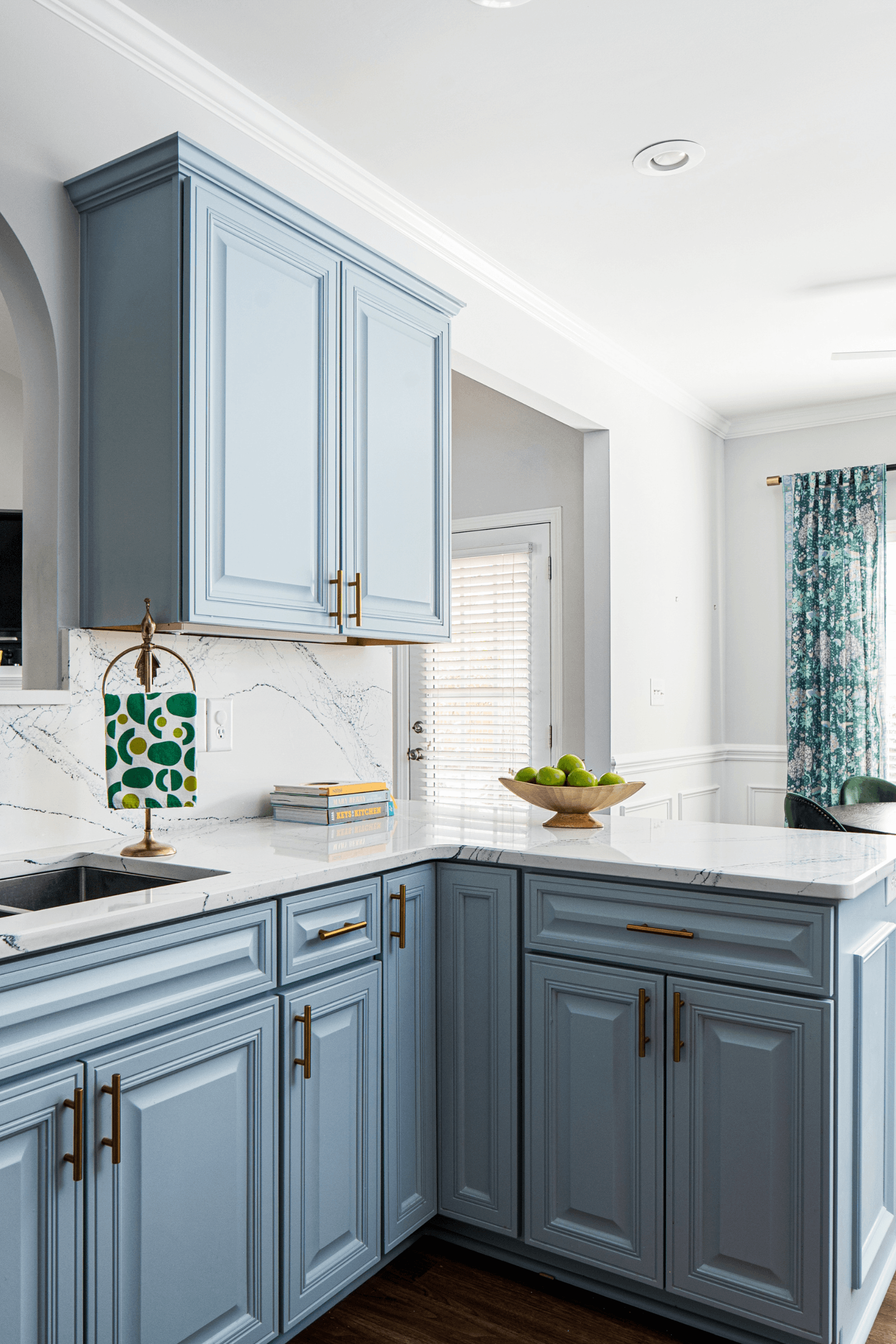
Despite keeping the original cabinetry, it looks like an entirely new kitchen! Removing the raised breakfast bar on the peninsula opened up the kitchen to the dining area and made the workspace far more functional.
Simple brass pulls replaced the dated knobs and bring contrast (and a little sparkle!) to the blue cabinets.
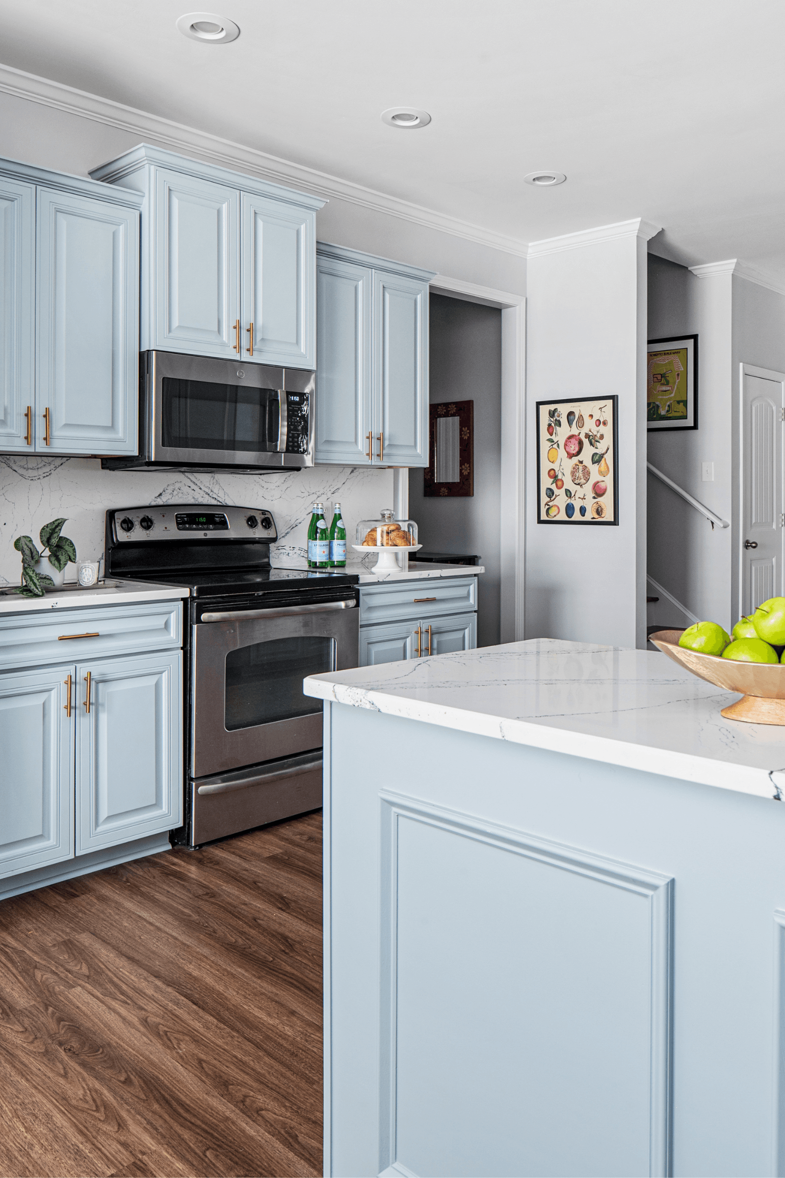
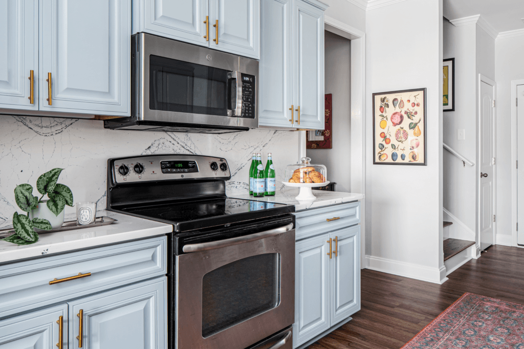
Kitchens can often feel cold due to the number of hard surfaces (think countertops, metal appliances, and painted cabinets) so introducing art, greenery, and textiles warms up the space.
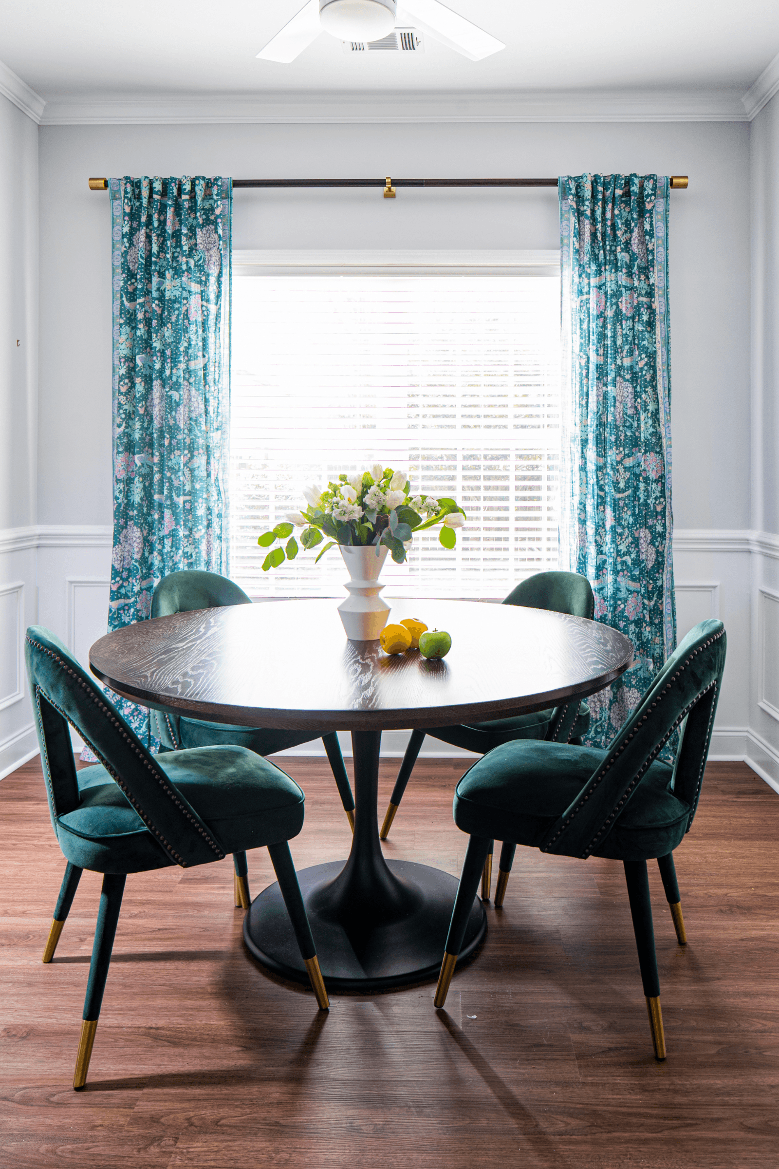
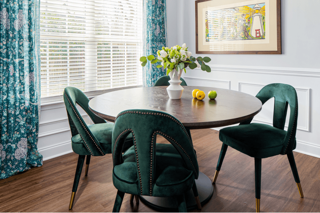
In the breakfast room, the window treatments are everything! The peacock pattern is light and fresh, and the addition of curtain panels finishes off the space and makes the window feel larger and wider than it actually is. The wood pedestal table provides visual weight and anchors the design.
Start Your Design Project
At Lesley Myrick Interior Design, we make the typically confusing design process seamless. Our high-touch, deeply engaged design process means that we accept just 12 large-scale remodeling projects per year with clients who are leaders in various industries and are ready to celebrate their successes with a personality-driven home that stands the test of time. Learn more about our full-service interior design and inquire here to start your design project.
