Before and After: A Dark Teal Kitchen with Funky Lighting
Who doesn’t love a good before-and-after? Get ready, because all month long I’m sharing a tour of our Texas home, including the living room, master bedroom, kids bedroom, my office, my husband’s office, and the kitchen. Finally – the dark teal kitchen!
Disclosure: Some of the products in this before-and-after were sponsored by brands I use and love for myself and for my clients, including Sherwin-Williams, Metrie, Lamps Plus, House of Antique Hardware, and The Findery. Thanks for your support!
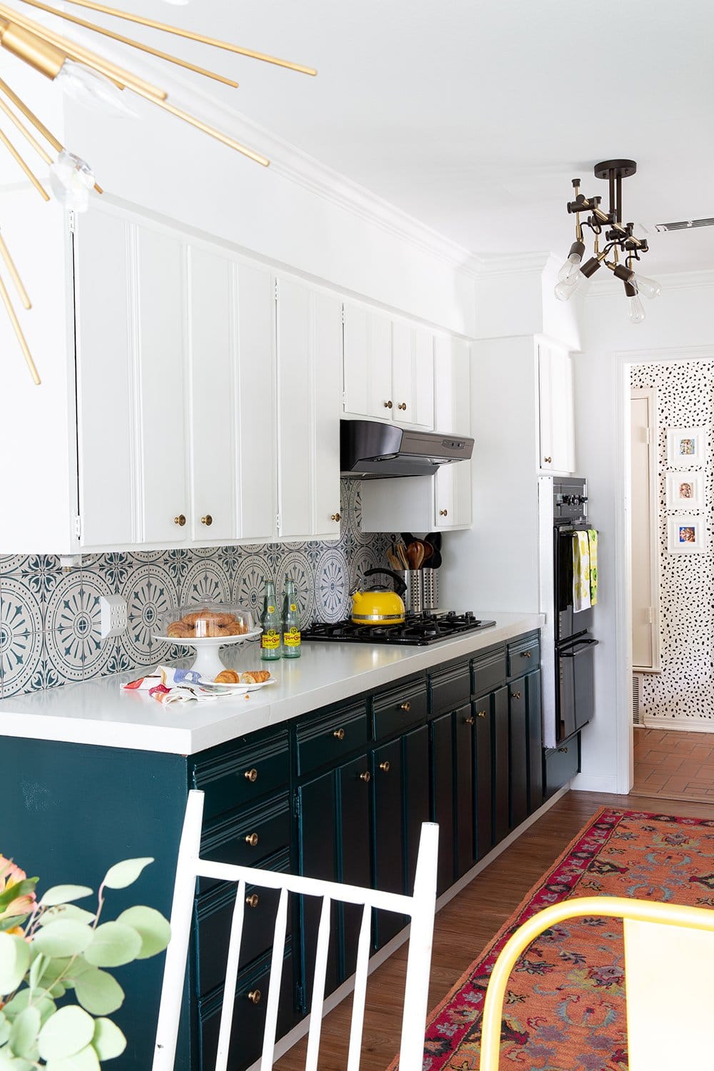
The 1950s were great.
Sure, they were great – like, 70 years ago. But kitchens do not usually stand the test of time, and our Waco kitchen from 1959 was no exception. While there was an attempt to update this space by a former homeowner in the 1990s, it wasn’t exactly a home run.
Here’s what the kitchen looked like the day we moved in:
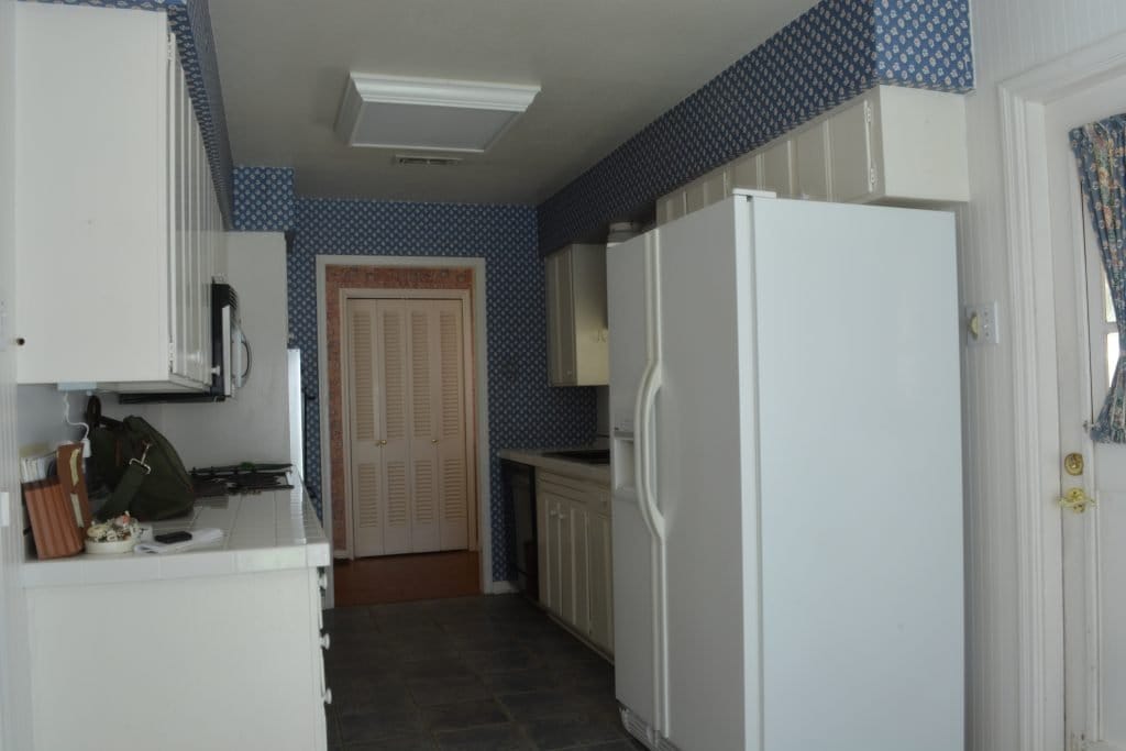
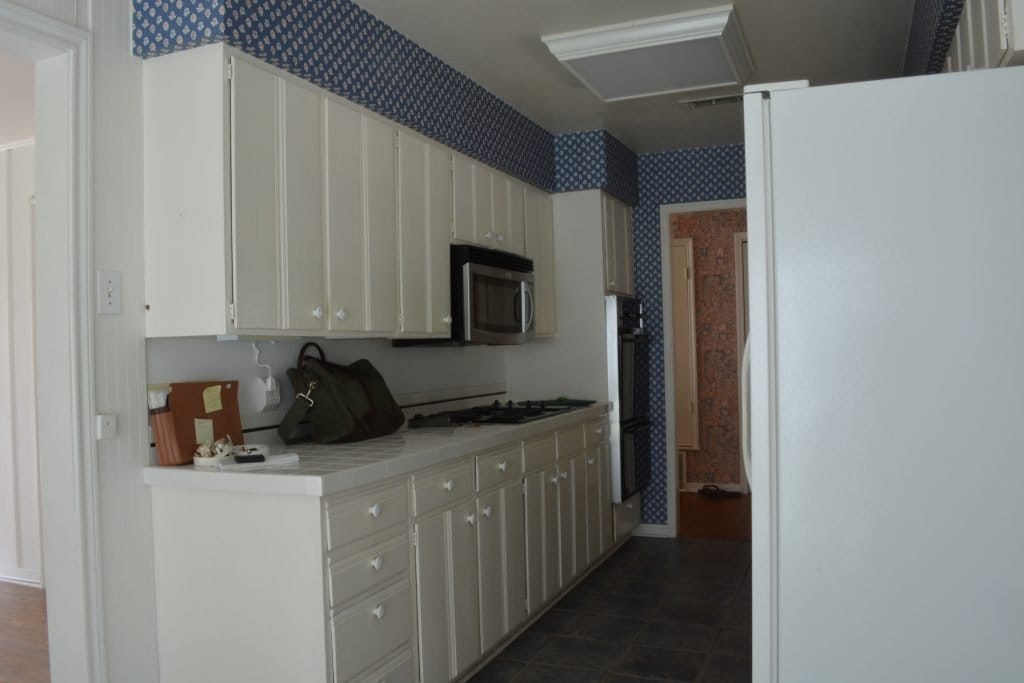
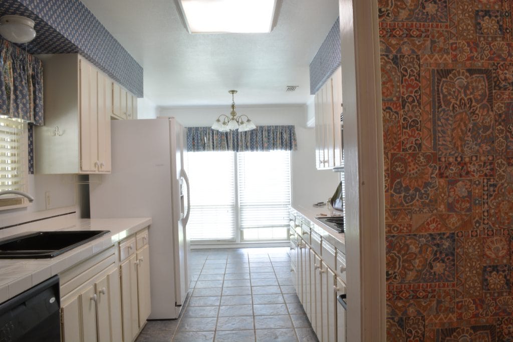
The cabinets were original to the home and had been painted white at some point, which certainly isn’t terrible, but they were definitely dingy. The flooring was awful ceramic tile made to look like slate, with grout lines a mile wide. (Ugghhh it got so dirty!) The wallpaper? Yeah, I could’ve lived without that. And that fluorescent faux-skylight light fixture? That needed to be ripped out, like, yesterday.
But the absolute worst part about this kitchen? The countertops. I’d have loved something as retro chic as Formica, but nope – these countertops were made of 4×4 white square tiles.
Tiles.
With grout.
As a countertop.
So. Gross.
So what improvements did we make to this kitchen?
As with the rest of the house, the flooring was the first major change. We ran the same vinyl plank through the entire house, which was such a needed update. The only flooring we kept as-is was the cool herringbone brick in the front entry, which you can see a snippet of in the photo above.
Lighting was next on the list, and boy did a couple of new fixtures update the look of this kitchen! We replaced the outdated fluorescent box with a cool industrial track light, and updated the chandelier in the dining area with a funky brass Sputnik-style pendant, thanks to Lamps Plus.
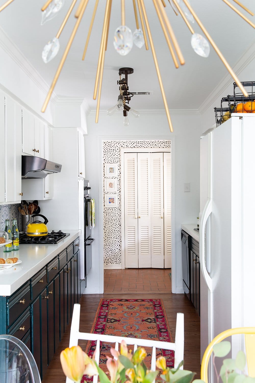
After we added crown molding and new baseboards from Metrie, everything got a fresh coat of my favorite crisp white paint, Sherwin-Williams Extra White. Everything, that is, except the lower cabinets, which we painted DARK TEAL! I loved Sherwin-Williams Cascades so much in this kitchen that I used the same color in my new office.
A dark teal kitchen had been my dream like, forever, and I’m so happy with how it turned out. Especially when we added this orange and fuschia wool runner which made the teal really pop.
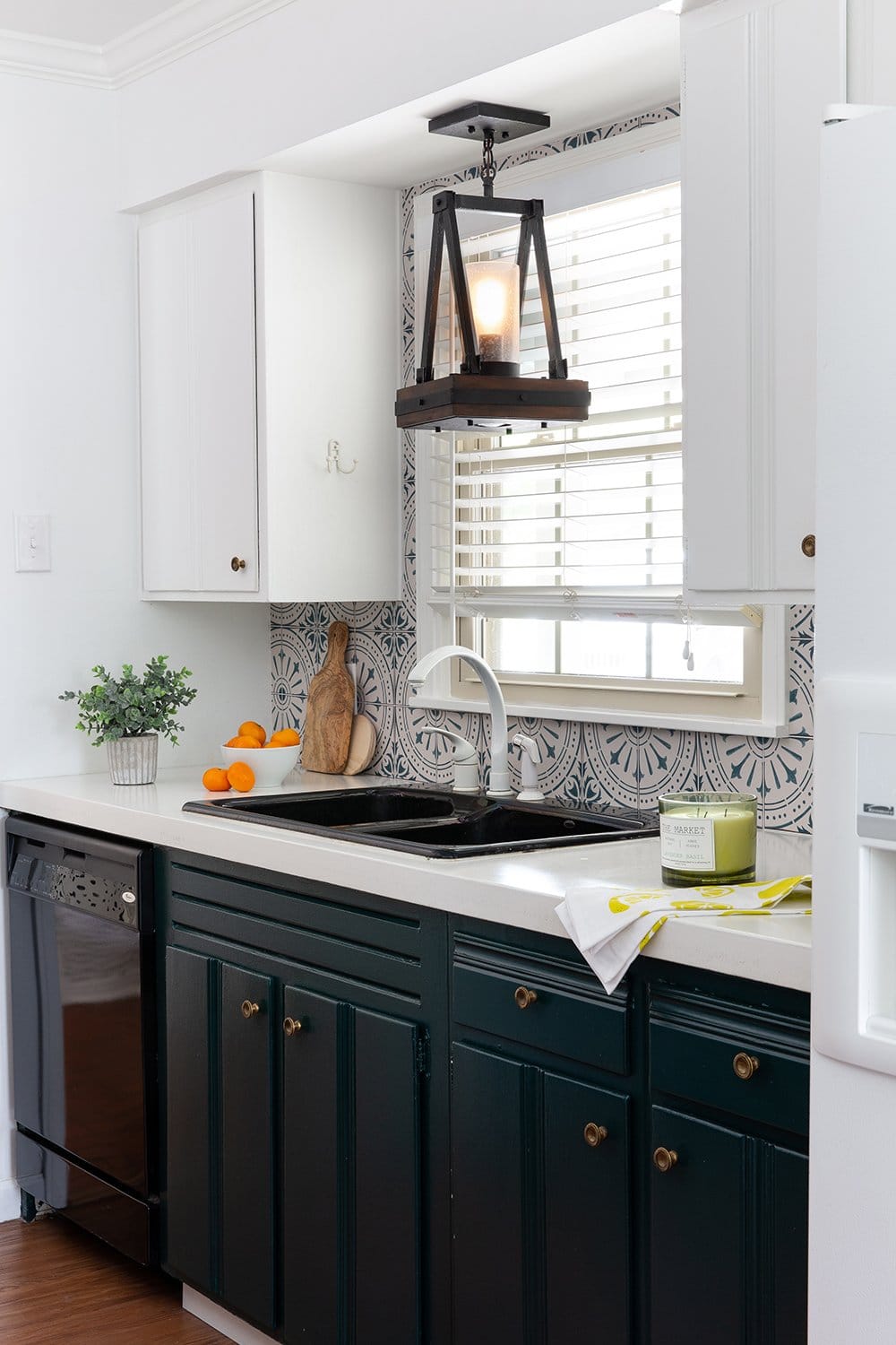
The boring white cabinet knobs were replaced with distressed antique brass knurled knobs, which brought a lot of texture and vintage character. And the backsplash was an awesomely easy DIY update – because it’s not tile. I tried out Quadrostyle Stickers because I’ve been so curious about peel-and-stick backsplashes, and this one was a smashing success. (Even my contractor didn’t realize it wasn’t tile until he looked closer.)
Since we kept the original cabinetry,
we were able to splurge on new countertops, and I have to tell you, concrete countertops are the bomb-diggity. Since our dining table was zinc and looked a little like natural concrete, we chose white concrete for the counters. Twisted Concrete in Texas totally made my countertop dreams come true. No more grout lines to clean!
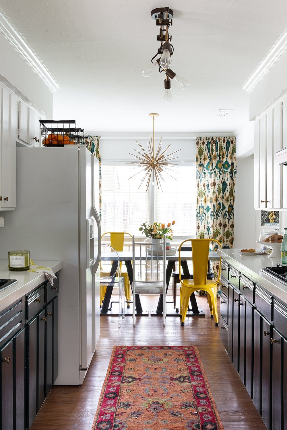
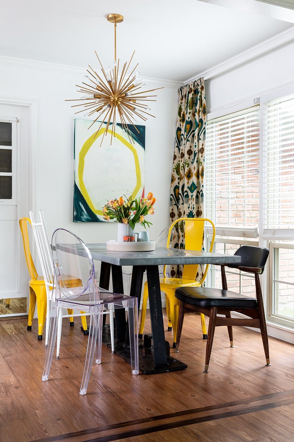
In the dining area of our dark teal kitchen,
we kept the mismatched chairs that we had collected over the years, and had a reclaimed zinc-top table custom made by The Findery in Waco, Texas. We loved the vintage iron bases, and were able to keep the same bases (but add a new, larger butcher block top) in our new home.
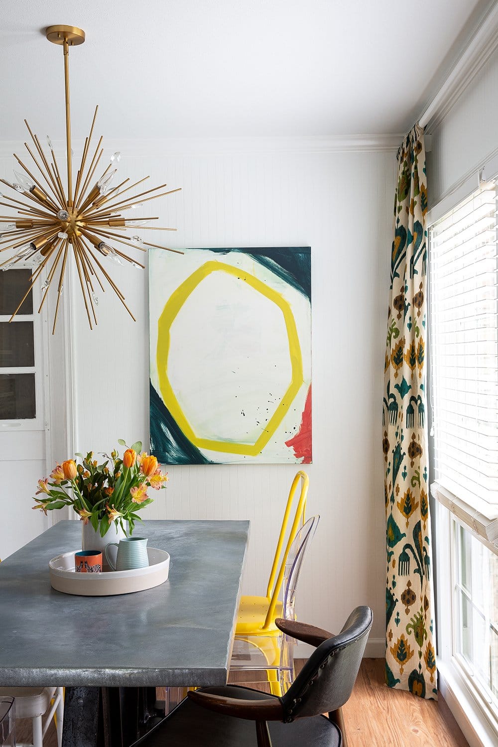
The oversize abstract art was made by me, inspired by Atlanta artist Britt Bass Turner. (Her paintings are waaaay better than mine, btw.) And the draperies are from World Market, but sadly, are no longer available.
Thanks so much for following along with the before-and-afters of my Texas home, including our dark teal kitchen. This was such a special house since it was the first home Nate and I bought, and the first house we were really able to put our stamp on. We were truly able to bust this home out of boring (and bust it out of ugly!) and I’d love to help you bust out of your boring home too.
Ready to start your design project? Learn more about our services or inquire with project details to get started.
